The Sector Rotation Chart
A quadrant view of every Nifty index's current strength and momentum.
This chart gives you a single view of where every Nifty index currently sits, along with the path it took to get there over roughly the past five weeks.
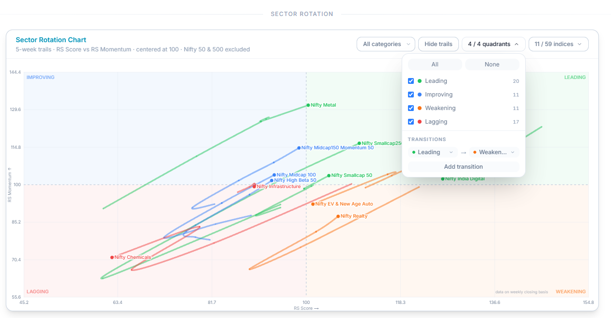
What's on Each Axis
The chart is built from two separate measures, plotted against each other.
The horizontal axis (RS Score) shows how an index is performing against the broader market right now — whether it's outperforming or underperforming.
The vertical axis (RS Momentum) shows whether that performance is currently improving or fading — not just how strong an index is, but which direction its strength is heading.
Both axes are centered at 100. A point sitting to the right of center means that index is currently outperforming; to the left means it's underperforming. Above center means its relative performance is improving; below center means it's deteriorating.
The Four Quadrants
- Leading — outperforming the market, and still improving. The strongest combination on the chart.
- Weakening — still outperforming, but momentum has started to fade.
- Lagging — underperforming, with momentum still fading.
- Improving — underperforming, but momentum has started to turn upward.
An index isn't fixed in one quadrant — its position shifts as its underlying strength and momentum change.
Reading the Trail
A single dot only tells you where an index stands today. Select Show Trails to see the path it's taken to get there — the last five weeks of movement laid out as a line rather than a single point.
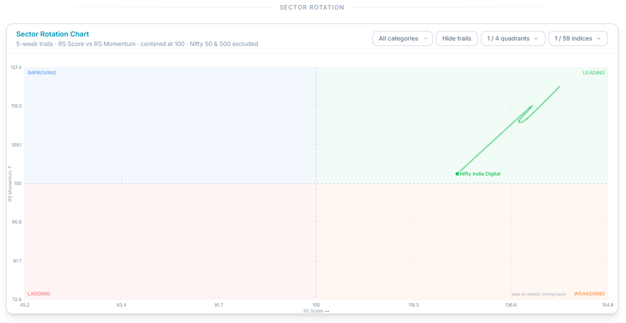
The trail tells you three things a dot alone can't: which direction an index is heading, how quickly it's moving, and whether that movement is accelerating or leveling off. There's also a typical pattern worth knowing: strength tends to rotate through these quadrants in a broadly clockwise sequence — Improving, into Leading, into Weakening, into Lagging, and eventually back to Improving again. It doesn't happen on a fixed schedule, but it's a useful shape to have in mind when reading a trail.
How to Use This in Practice
Start with where an index sits right now — which quadrant, and how far from the center. Then look at the trail behind it. An index sitting in Leading with a long trail arriving from Improving tells a different story than one sitting in Leading but starting to curve back toward Weakening, even though both are in the same quadrant today.
Common Questions
Does landing in "Leading" mean an index will stay there?
No — this chart shows current position and its recent five-week trail only. Indices move between quadrants regularly, and this isn't a prediction of what happens next.
Which matters more, the quadrant or the trail?
Neither on its own tells the full story. The quadrant shows where an index stands today; the trail shows how it got there and how fast it's moving — reading them together gives you a much clearer picture than either alone.
Related Articles
What Is Nifty Indices? · The Top Indices RS Trend Chart · Index RS Movers: Winners and Losers