Advance Decline, 52-Week High/Low, and Stage 2 Stocks %
Three charts tracking breadth over time, explained.
Three charts track breadth over time: the Advance-Decline Oscillator, 52-Week Highs vs Lows, and Stage 2 Stocks Over Time.
Advance-Decline Oscillator
The Advance-Decline (A/D) oscillator measures market breadth by tracking the difference between advancing and declining stocks. The bars show daily net advances/declines (green positive, red negative), while the green cumulative line shows the overall trend. Extreme breadth zones (amber lines on the right axis) indicate potential overbought/oversold conditions.

Pro Tip: Initiating a new position when the market is in extreme oversold conditions gives a higher chance of that position being profitable on day 1 — markets usually mean-revert after an extreme negative day, providing great opportunities.
52-Week Highs vs Lows
This chart displays the number of stocks making new 52-week highs (green bars above the axis) versus new 52-week lows (red bars below the axis).

A healthy market typically shows more new highs than lows. When new lows exceed new highs, it may signal market weakness.
Stage 2 Stocks Over Time
% Stage 2 Stocks tracks the percentage of NSE500 stocks currently in Stage 2 (accumulation phase).
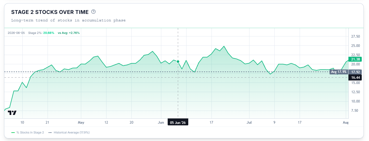
Higher percentages indicate a healthier market with more institutional accumulation. Historically, readings above 25% signal strong market participation.
These charts collectively show the current environment the market is trading in, and can act as a gauge to help you decide whether to be aggressive or defensive, bullish or bearish, with respect to the broader market.