The Market Rotation Signal
Whether mid and small caps or large caps are currently leading.
The Market Rotation Signal compares the Nifty (Midsmall 400 / Nifty 100) ratio against its 200-day moving average.
The blue line is the current ratio, while the yellow dotted line is the average.
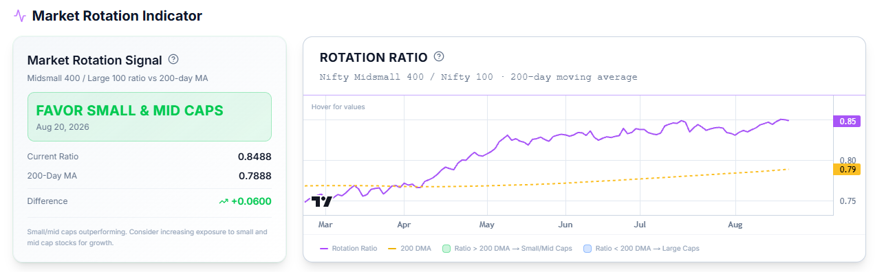
When the ratio sits above its average, it can be inferred that mid and small cap stocks will do better than large caps; when the ratio sits below the average, large caps are to be preferred.
This helps you track your capital allocation and prevent drawdowns in your portfolio.
Common Questions
Does the Rotation Signal tell me which stocks to buy?
No — it describes which market-cap segment is currently outperforming the other. It helps in your capital allocation decisions across various market caps.
How can I check market-cap rotation (large vs. mid vs. small) elsewhere on the platform?
Besides this chart, both the RS screen and the Stage 2 screen have a Market Cap Segmentation panel showing which market cap currently has strength or momentum.