Read the Tracking Table
The filter row, view types, and what each column in the table means.
The table is the core of the Tracking List — every stock you're watching, with its price, RS, Stage, and other stats in one row.
Filtering the Table
Above the table is a filter row: All Sectors, All Industries, All Market Caps, All Stages, and a Mean Reversion toggle (Include/Exclude). Narrow the table using any combination of these, and use Reset to clear them all at once. Filters only change what you see — they don't remove stocks from the watchlist itself.

Switching Views
Three view options sit above the table: Table, Chart, and Grid.
- Table is the default row-and-column layout described below
- Chart and Grid present the same tracked stocks in a different visual format, useful if you want to scan by price movement or layout instead of numbers
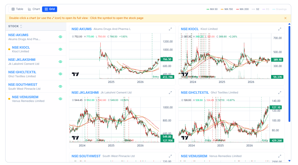
Reading the Columns
Each row is one stock. The columns are:
- Stock — the ticker and company name
- Price — current price and the day's percentage change
- RS — the stock's current RS Percentile
- Stage — its current Stage classification
- Days — how many days it has held its current Stage
- 52Wk — where the price sits relative to its 52-week range, with the change from the 52-week high and low
- Sector and Industry — its classification
- Mcap — market capitalization
- P/E — price-to-earnings ratio
- EPS Growth — earnings-per-share growth
- ROE — return on equity
- Added — the date the stock was added to this watchlist
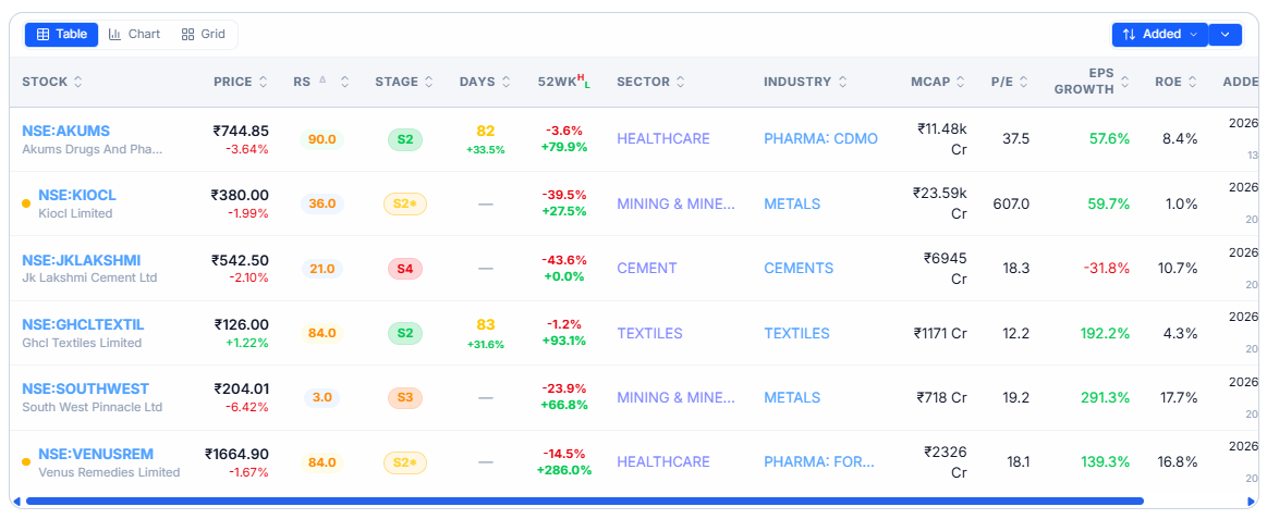
Tap any column header to sort the table by that column.
Common Questions
Why does a stock in my watchlist show no 52Wk change?
A dash usually means WealthLab doesn't have enough price history for that stock yet — this is common for stocks that listed recently.
Related Articles
Build and Manage My Watchlists · What Is Portfolio Pulse? · Tracking Analytics