Track RS Trends for My Watchlist
How your watchlist's industries and stocks have moved over time.
Two charts in Tracking Analytics show how RS has moved over time for the industries and stocks in your watchlist, rather than just their current RS value.
Industry RS Trends
Tap Load Industry RS Trends to bring up a 40-week line chart of RS Percentile for the industries represented in your list.
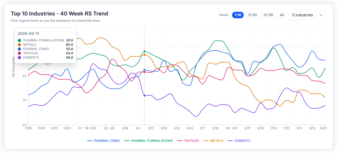
Use the Ranks toggle (1–10, 11–20, 21–30, All) to switch which slice of industries is plotted, and the dropdown to control how many lines show at once. Click any legend item to hide or show that industry's line individually.
Stock RS Trends
Tap Load Stock RS Trends for the same kind of chart, but for individual stocks in your watchlist, plotted over a 365-day history.
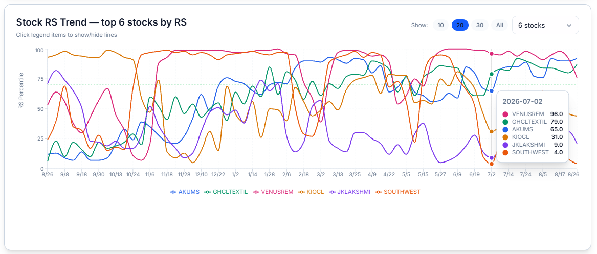
Use the Show toggle (10, 20, 30, All) and the stock-count dropdown to control the time window and how many stocks are plotted, and click legend items to isolate a single stock's line.
Common Questions
Are these the same RS values shown in the table above?
Yes — the trend charts are the same RS Percentile figures from the table, just plotted over time instead of shown as a single current number.
Can I see sector/industry RS trends for my tracked portfolio?
Yes — the Industry RS Trends chart on this page is exactly that: scroll down on the Tracking page to see the RS curve of the industries represented in your watchlist.
Related Articles
Tracking Analytics · Track Sector Rotation Chart for My Watchlist · Read the Tracking Table