Tracking Analytics
Comparing your watchlist's industry and market-cap makeup against the market.
Tracking Analytics sits below the table and compares the makeup of your watchlist against the broader market, using two donut charts.
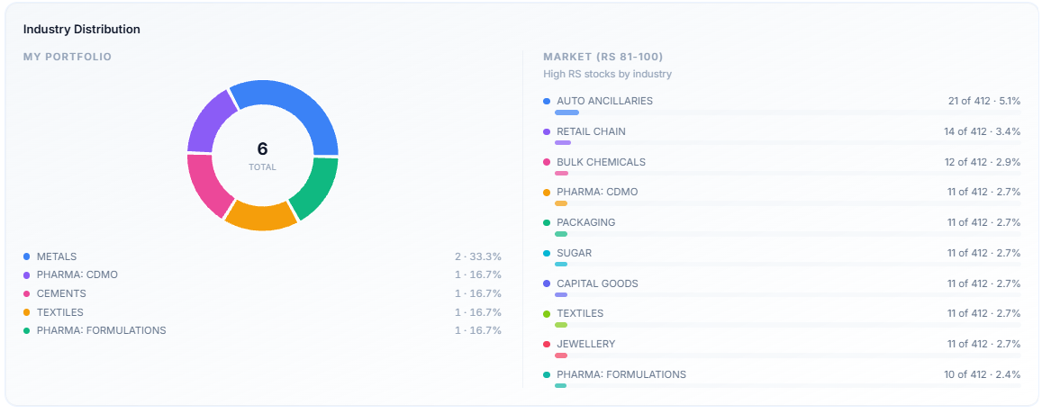
Industry Distribution
The left side, My Portfolio, shows what share of your watchlist belongs to each industry.
The right side, Market (RS 81–100), shows which industries do the top 20% of the stocks come from.
This gives you a benchmark for how your tracking list compares to the broader market.
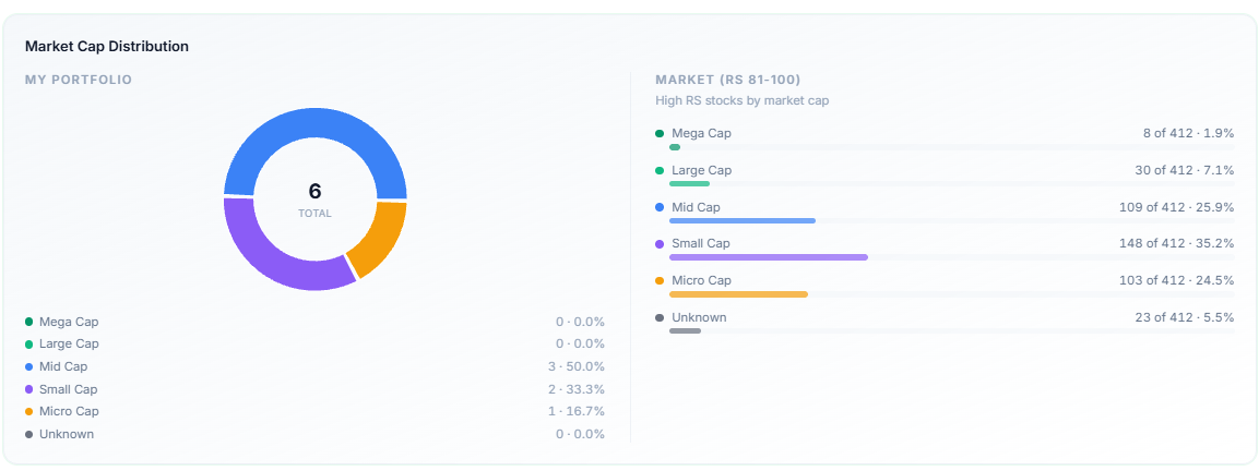
Market Cap Distribution
The left side, My Portfolio, shows what share of your watchlist belongs to each market cap.
The right side, Market (RS 81–100), shows which market cap does the top 20% of the stocks come from.
This gives you a benchmark for how your tracking list compares to the top 20% of the current market.
Reading the Comparison
Both charts use the same "my list vs. high-RS market" format. If your watchlist is mostly Mid and Small Cap, for instance, but the right side shows that the high-RS stocks favour Large Cap, it helps you understand that the market is favouring large caps while you are looking at small and mid caps.
Common Questions
Why does the market side only cover RS 81–100?
RS 81-100 is the top 20% of the stocks in the market by strength.
It's a benchmark against the market's strongest stocks by RS, not the whole market — the idea is to compare your list to where relative strength is currently concentrated.