Track Sector Rotation Chart for My Watchlist
Seeing where your sectors and industries sit on the rotation map.
This chart plots the sectors and industries in your watchlist on a rotation map, showing whether they're currently Leading, Improving, Weakening, or Lagging relative to the market.
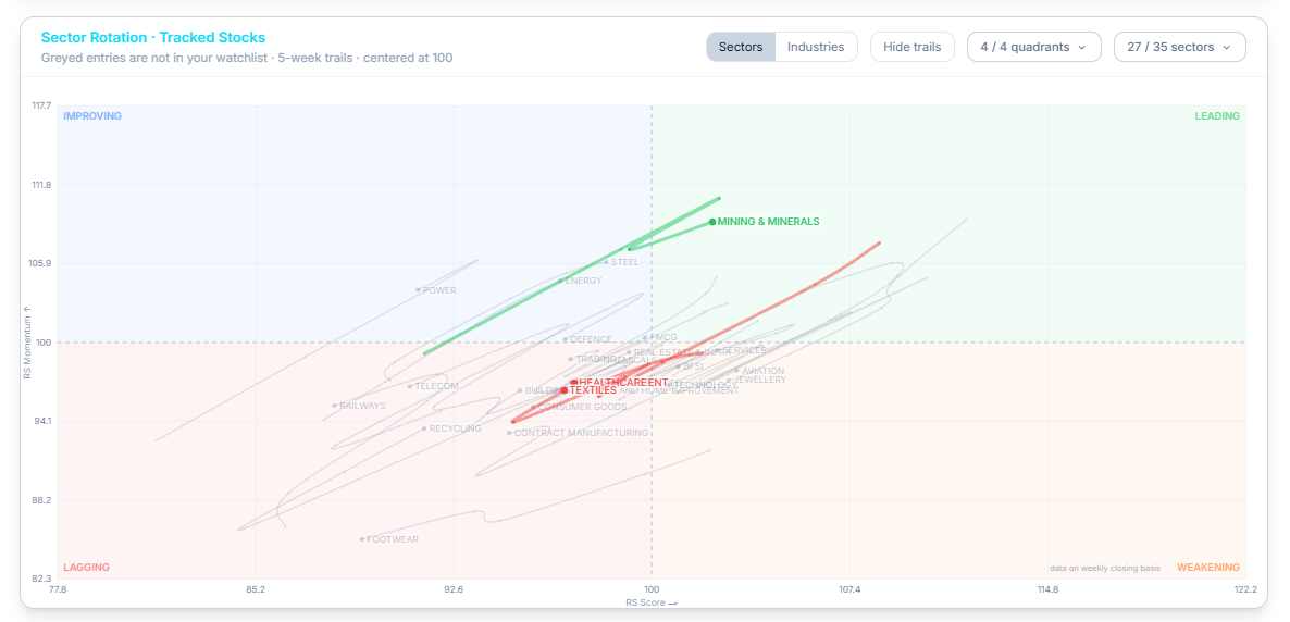
Loading and Reading the Chart
Tap Load Sector Rotation Chart to bring it up. Each point represents a sector or industry, plotted using its RS Score and RS Momentum, with a trail showing its recent path across the previous 5 weeks. Each industry or sector sits in a particular quadrant:
- Leading — strong RS Score and strong momentum
- Improving — momentum is picking up, but RS Score hasn't caught up yet
- Weakening — RS Score is still strong, but momentum is fading
- Lagging — weak on both measures
Filtering the Chart
Toggle between Sectors and Industries to change what's plotted. Use the quadrant filter (for example, 1/4 quadrants) and the sector/industry count dropdown to narrow what's shown. Hide trails removes the movement lines and leaves just the current position of each point. Sectors and industries not currently in your watchlist appear greyed out for context.
Related Articles
Track RS Trends for My Watchlist · Tracking Analytics · Today's Focus