Stock's Relative Strength Chart
The stock's RS Percentile plotted across its full history.
This chart is about the stock's own relative performance over time — not compared to itself, but compared to everything else in the market.
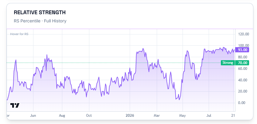
Reading the Chart
This plots the stock's RS Percentile across its entire history. Watching this line over time tells you a different story than the current number alone does.
A stock sitting at a middling RS today might have spent months above the Strong line before drifting down, or it might be climbing back up toward it. The shape of the line matters as much as where it currently sits.
Common Questions
Does this chart use the same RS number as the RS Rating card at the top of the page?
Yes — this is the full history behind that same number, plotted over time instead of shown as a single current value.
Related Articles
What Is a Stock Detail Page? · The Industry vs NSE500 Chart · Fundamentals Panel