The Industry vs NSE500 Chart
How the stock's industry has performed against the Nifty 500.
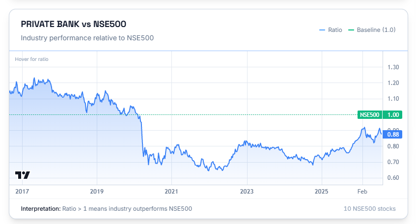
This chart tells you how is the industry of the referred stock performing vs Nifty 500. This allows you to get an overall view of the industry the stock belongs to, along with the stock itself.
Reading the Chart
This is measured as a ratio against the Nifty 500, with a baseline of 1.0. A ratio above 1 means the industry has been outperforming the Nifty 500; below 1 means it's been underperforming.
Common Questions
If this chart is the same for every stock in the industry, why show it on an individual stock's page?
Because a stock's fortunes are tied to its industry's. Seeing this alongside the stock's own RS chart gives you a fuller picture than either on its own — how the stock has done, and how the industry around it has done against the broader market.