The Price Chart
Candlestick, bar, or line view, with indicators and drawing tools.
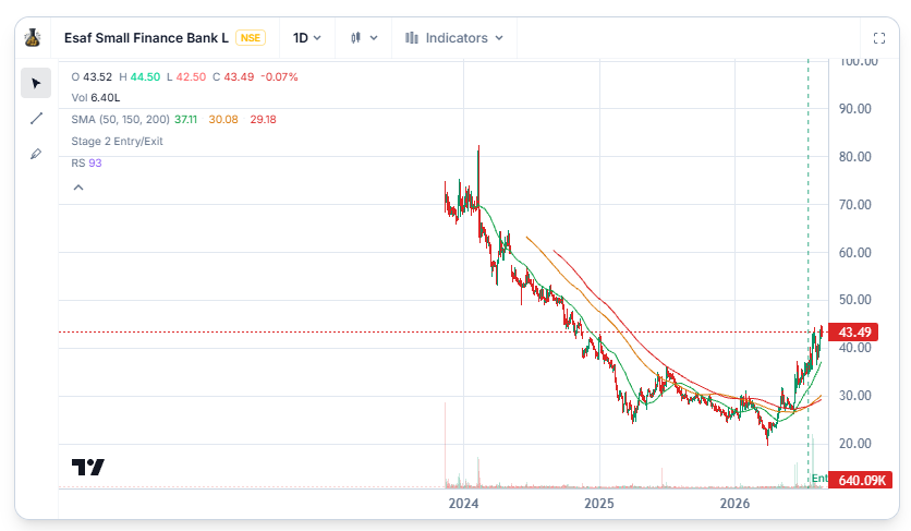
Every stock page on WealthLab includes a price chart, showing the stock's trading history as candlesticks by default — the classic open, high, low, close view most people are used to.
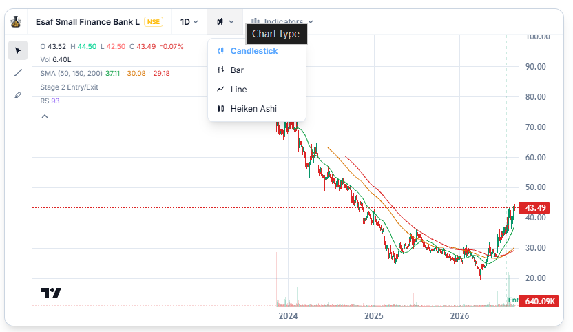
Switching Chart Types
You're not locked into candlesticks. The chart can be switched to:
- Bar chart, which shows the same open-high-low-close information in a slightly different visual style
- Simple Line chart, which just connects closing prices and strips away the extra detail — useful when you want a cleaner read on overall direction without the noise of every day's range.
Changing the Timeframe
Above the chart, you can switch between different time intervals — from daily candles up to weekly — depending on whether you're looking at recent short-term movement or a longer stretch of history.
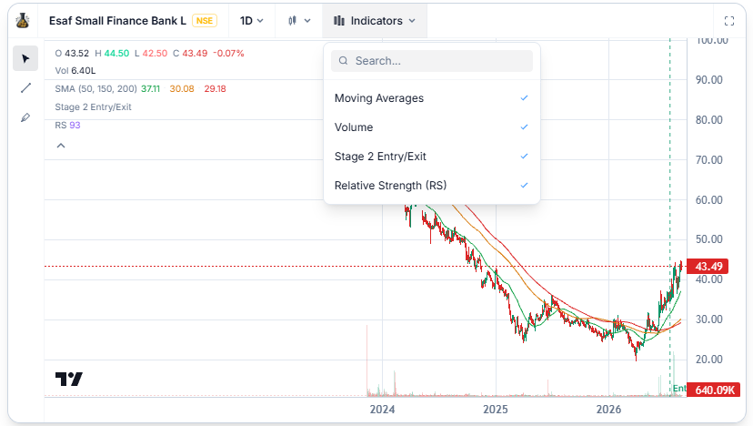
Indicators and Drawings
Beyond the basic price view, the chart supports adding indicators — overlays like moving averages that plot directly on top of price — as well as drawing tools, so you can mark up the chart with your own trendlines or annotations as you're looking at it.
Related Articles
What Is a Stock Detail Page? · Fundamentals Panel · Stock's Relative Strength Chart