RS Trend and Rate of Change Charts
How the index's relative strength has moved, and how fast.
Two charts track how the index's own relative strength has moved over time, rather than just where it stands today.
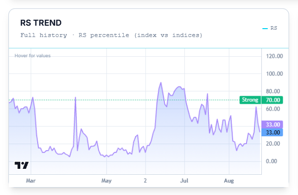
RS Trend
Plots the index's RS percentile against every other index, across its full history.
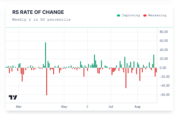
RS Rate of Change
Shows the week-over-week change in the index's RS percentile as bars — green for weeks it improved, red for weeks it weakened. Where RS Trend shows you the level, this shows you the speed and direction of movement week to week.
Common Questions
Why is there only one line on RS Trend here, when the industry page shows two?
An industry page is tracking many stocks at once, so it shows an average and a median. An index page is tracking one thing — the index itself — so there's just the one line.
Related Articles
Price Chart · Quarterly Earnings Trends · Breadth & Momentum