Index vs NSE500 Chart
How the index as a whole has performed against the broader market.
Was this helpful?
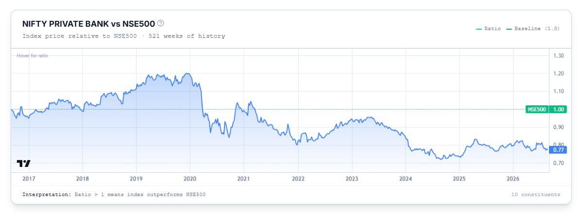
This chart shows how the index as a whole has performed against the broader market over time.
Reading the Chart
Plots the index's own price as a ratio against the Nifty 500, with a baseline of 1.0. A ratio above 1 means the index has been outperforming the Nifty 500; below 1 means it's been underperforming.
Common Questions
How is this different from the Index Price Chart?
The Index Price Chart shows the index's raw price. This chart shows its price relative to the Nifty 500 — so a flat line here can still mean the index is rising, just at the same pace as the broader market.
Related Articles
Breadth & Momentum · Price Chart · Comparing Stocks Within an Index