Comparing Stocks Within an Index
A bubble chart and a sortable table of every constituent.
The last section on the page turns the index-level view into a stock-by-stock one, letting you see every constituent side by side.
The Bubble Chart
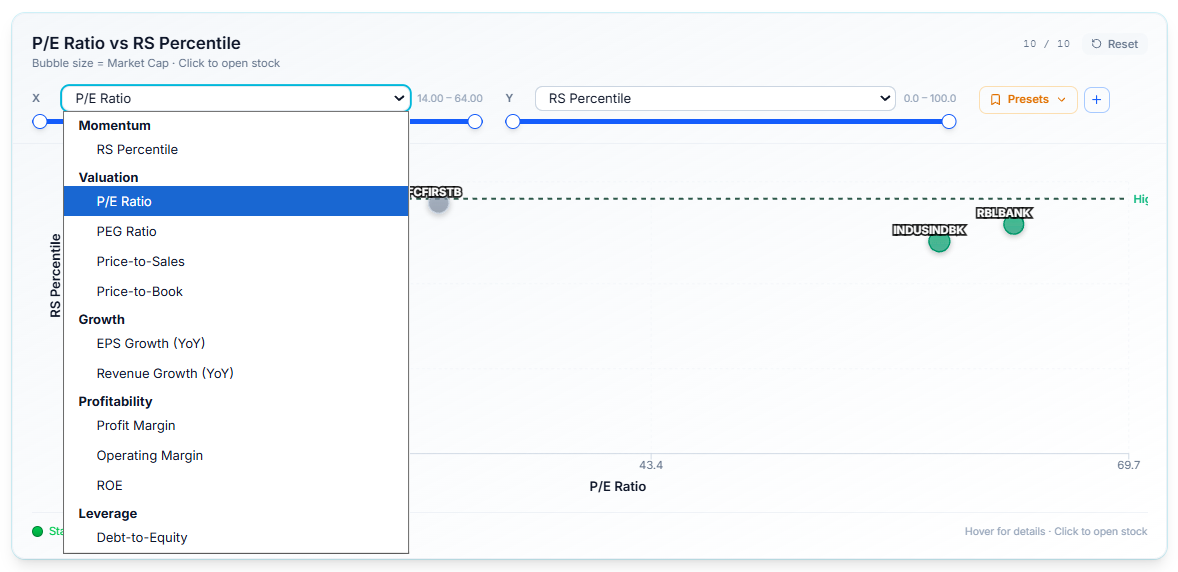
Plots every stock in the index against each other on two axes you choose yourself — not fixed to any one pair of metrics.
Select from a multi-select dropdown covering valuation, earnings, pricing, and more, so you can compare the constituents however's actually useful to you:
- P/E against RS Percentile to spot cheap-but-strong stocks
- EPS Growth against Market Cap to see whether the smaller names or the larger ones are driving growth
- any other combination the dropdown offers.
Bubble size represents market cap, so even a two-metric view still carries a third dimension.
Why This Matters
A single ranked table shows you the index one column at a time. This chart lets you see all its constituents positioned across two dimensions at once — where the strength is concentrated, where the value is, which stocks stand out as outliers — in a way a table alone can't show you.
Because you choose both axes, you're not stuck with one fixed view; you can ask a different question of the same index just by changing what's plotted.
Select either axis to change the comparison, or choose a saved Preset to jump straight to a common combination.
The Index Constituents Table
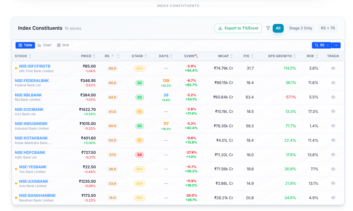
Lists every stock in the index with its Price, RS, Stage, Days, 52-week range, Market Cap, P/E, EPS Growth, and ROE. Filter to Stage 2 Only or set a minimum RS, switch between Table, Chart, and Grid, and select Export to TV/Excel to pull the whole list out.
Common Questions
Can I narrow this down to just P/E vs RS?
That's one of the views you can select, not the only one — the chart supports a wide range of axis combinations beyond that specific pair.
Related Articles
What Is an Individual Index Page? · Index vs NSE500 Chart · Breadth & Momentum