Comparing Stocks Within an Industry
A P/E vs RS bubble chart and a sortable table of every stock inside.
The last section on the page turns the industry-level view into a stock-by-stock one, letting you see every company inside it side by side.
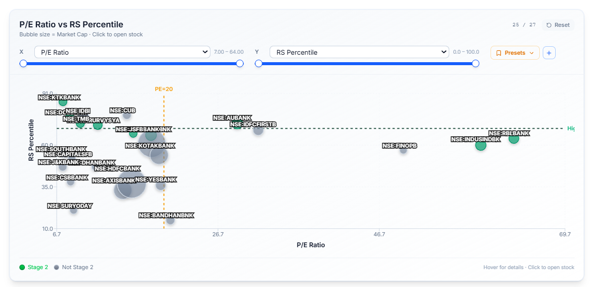
The Bubble Chart
Plots every stock in the industry against each other on two axes you choose yourself — not fixed to any one pair of metrics. Bubble size represents market cap, so even a two-metric view still carries a third dimension.
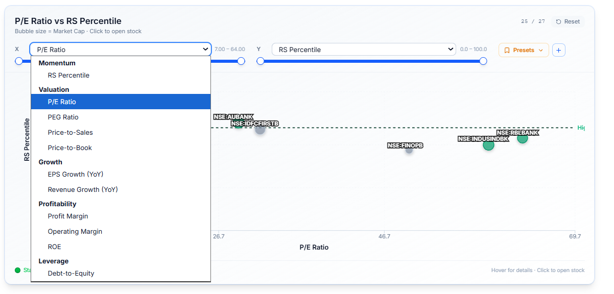
Select from a multi-select dropdown covering valuation, earnings, pricing, and more, so you can compare the industry however's actually useful to you:
- P/E against RS Percentile to spot cheap-but-strong stocks
- EPS Growth against Market Cap to see whether the smaller names or the larger ones are driving growth
- any other combination the dropdown offers
Why This Matters
A single ranked table shows you the industry one column at a time. This chart lets you see the whole industry positioned across two dimensions at once — where the strength is concentrated, where the value is, which stocks stand out as outliers — in a way a table alone can't show you.
Because you choose both axes, you're not stuck with one fixed view; you can ask a different question of the same industry just by changing what's plotted.
Select either axis to change the comparison, or choose a saved Preset to jump straight to a common combination. Select any bubble to open that stock's own page directly.
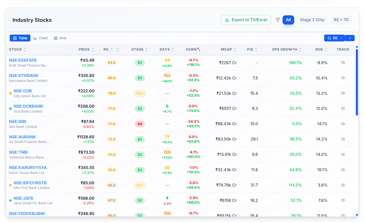
The Industry Stocks Table
Lists every stock in the industry with its Price, RS, Stage, Days, 52-week range, Market Cap, P/E, EPS Growth, and ROE. Filter to Stage 2 Only or set a minimum RS, switch between Table, Chart, and Grid, and select Export to TV/Excel to pull the whole list out.
Common Questions
What does the green dot next to some stocks mean on the bubble chart?
It marks stocks currently in Stage 2, distinct from the gray dots used for stocks in other stages.
Related Articles
What Is an Industry Page? · Industry vs NSE500 Chart · Breadth and Momentum