RS Trend and Rate of Change Charts
How the industry's relative strength has moved, and how fast.
Two charts track how the industry's relative strength has moved over time, rather than just where it stands today.
RS Trend
Plots the industry's Avg RS and Median RS percentile across its full history.
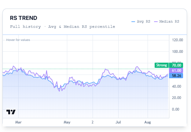
While the average RS tells you the relative strength of all the stocks in the industry combined, the median RS tells you whether that strength is coming from a single stock or is broad-based across the industry.
If median RS is above average RS, it means the majority of stocks are outperforming the industry as a whole — participation is broad.
If the median RS is below average RS, that means the median stock is underperforming the industry, which also means participation is narrow.
RS Rate of Change
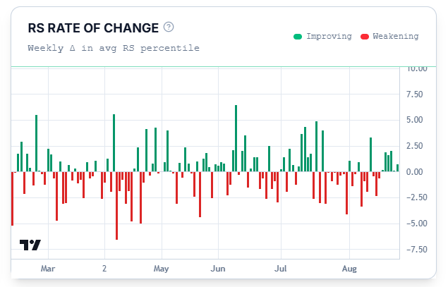
Shows the week-over-week change in the industry's average RS as bars — green for weeks where strength improved, red for weeks it weakened. This is the trend chart's companion: where RS Trend shows you the level, Rate of Change shows you the speed and direction of movement week to week.
Common Questions
Does a run of green bars mean I should buy into this industry?
No. It describes recent relative-strength movement only. More green bars versus red bars means the strength is improving, while more red bars versus green bars would mean that the strength is decreasing. These are not buying recommendations.
Related Articles
Industry at a Glance · Breadth and Momentum · Industry vs NSE500 Chart