Industry vs NSE500 Chart
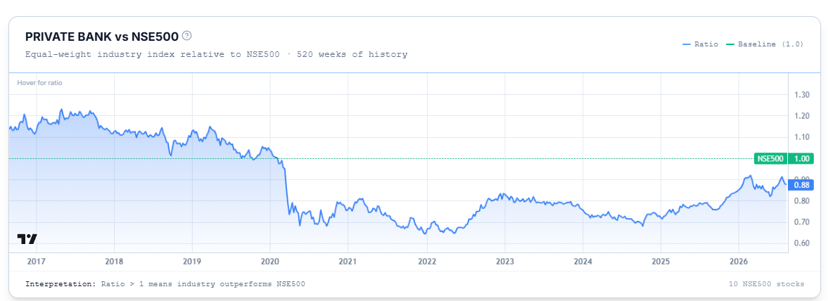
How the whole industry has performed against the Nifty 500.
This chart shows how the industry as a whole has performed against the broader market over time.
Reading the Chart
Plots an equal-weight index of the industry as a ratio against the Nifty 500, with a baseline of 1.0. A ratio above 1 means the industry has been outperforming the Nifty 500; below 1 means it's been underperforming.
Common Questions
Is this the same ratio shown on individual stock pages within this industry?
Yes — every stock in the same industry shows this identical chart, since it's describing the industry's performance, not any one stock's.
Why does an industry page sometimes not show this chart?
This ratio chart won't display if the industry has no stock in the Nifty 500, or has fewer than 3 stocks — in either case the ratio would be too skewed to be meaningful.